
The Guardian - UI
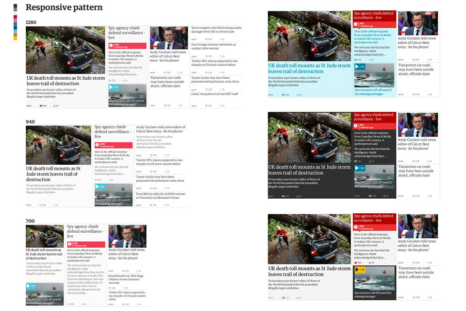
Scaling up mobile
A separate mobile site already existed for the Guardian, we scaling it up for all breakpoints.


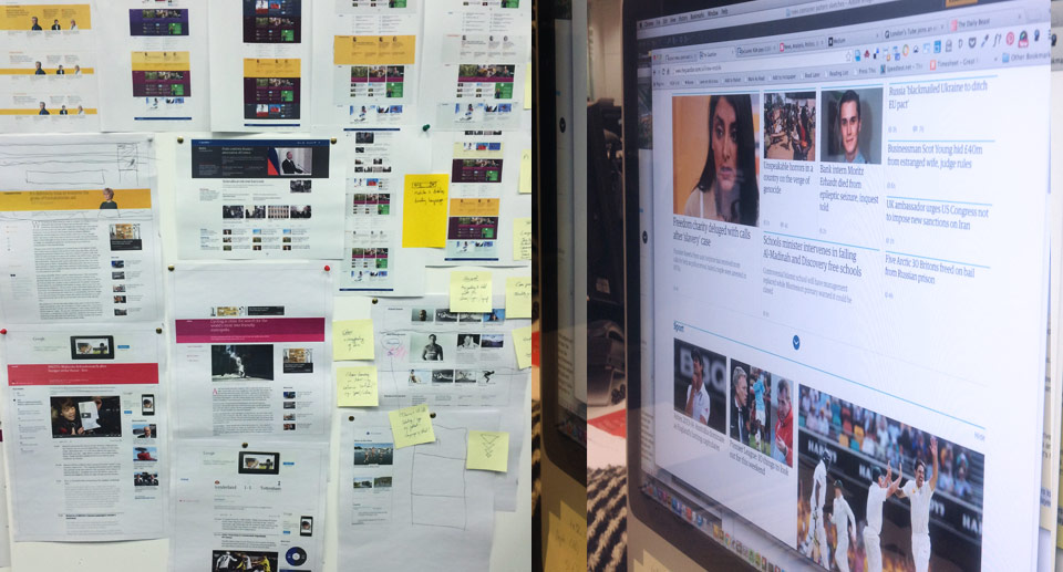
Designed in the open
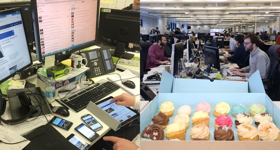
An uncomfortable experience at first, but now I'm converted! User testing high polished flats over-promise, they are good for conversations but they can't tell the full interactive experience. Visual design needs to evolve and mature in the browser. With so much varied content, nuances have to be experienced over time. You can't be too precious, things change. It's liberating. It's like an oil painting - layering, reworking the marks, step back for holistic reassments, no one paints the final detail from one corner to the other. The challenge of course - is managing design and UX debt in a sprint process.

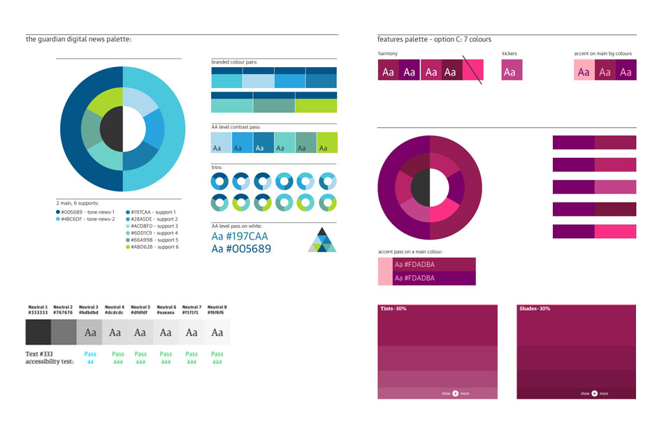
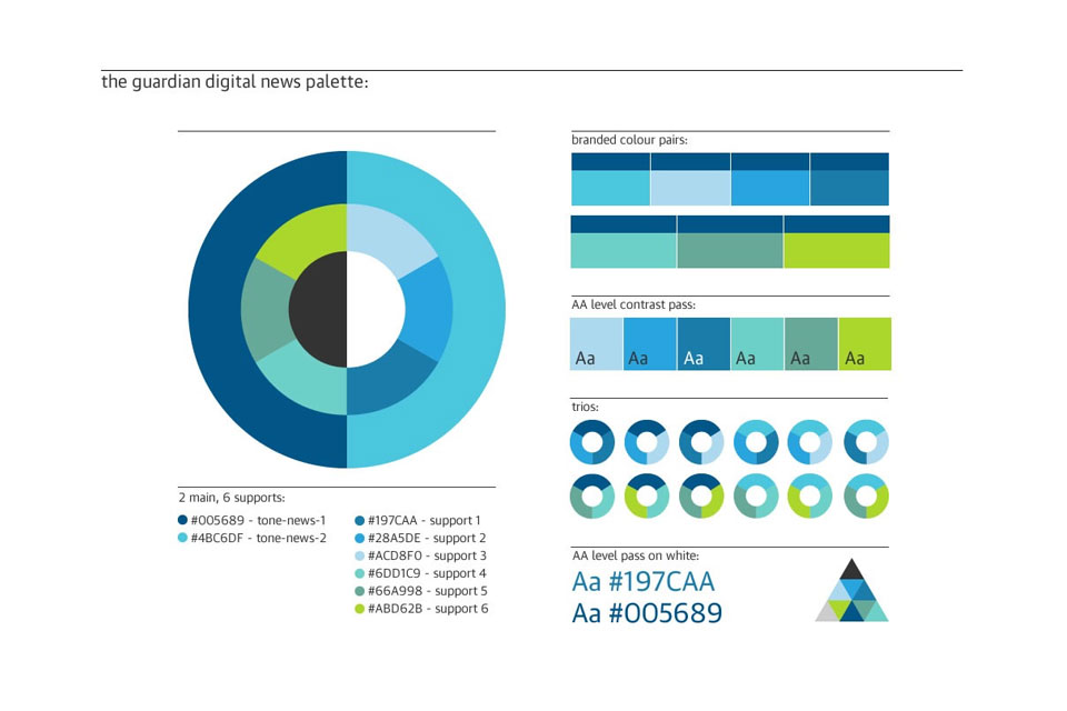
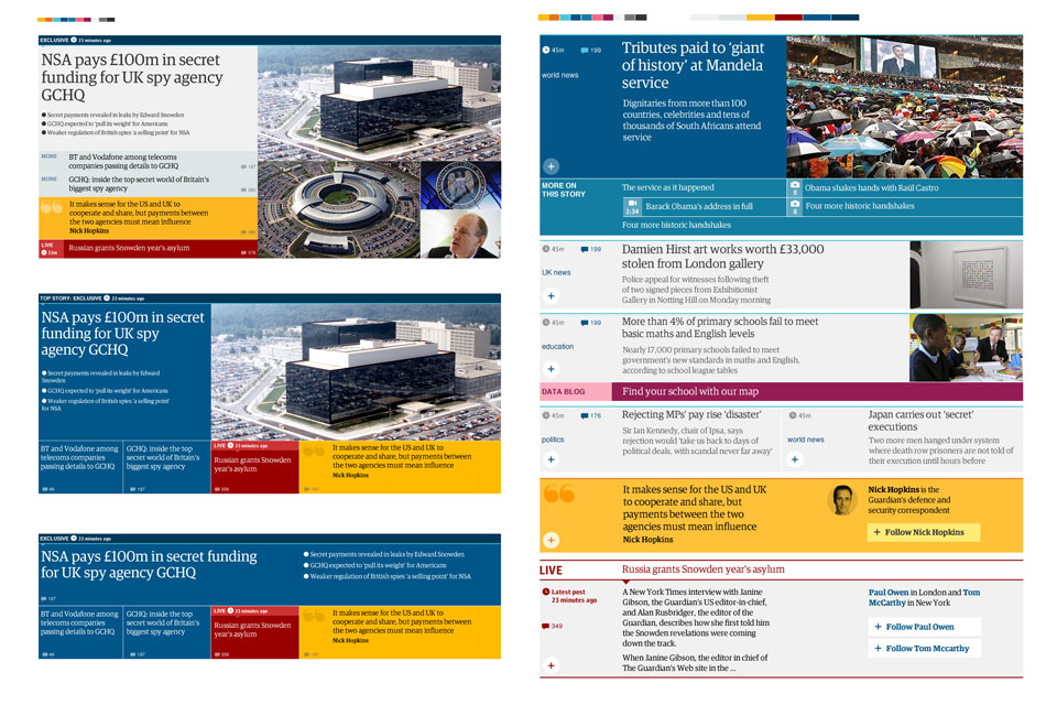
Tone
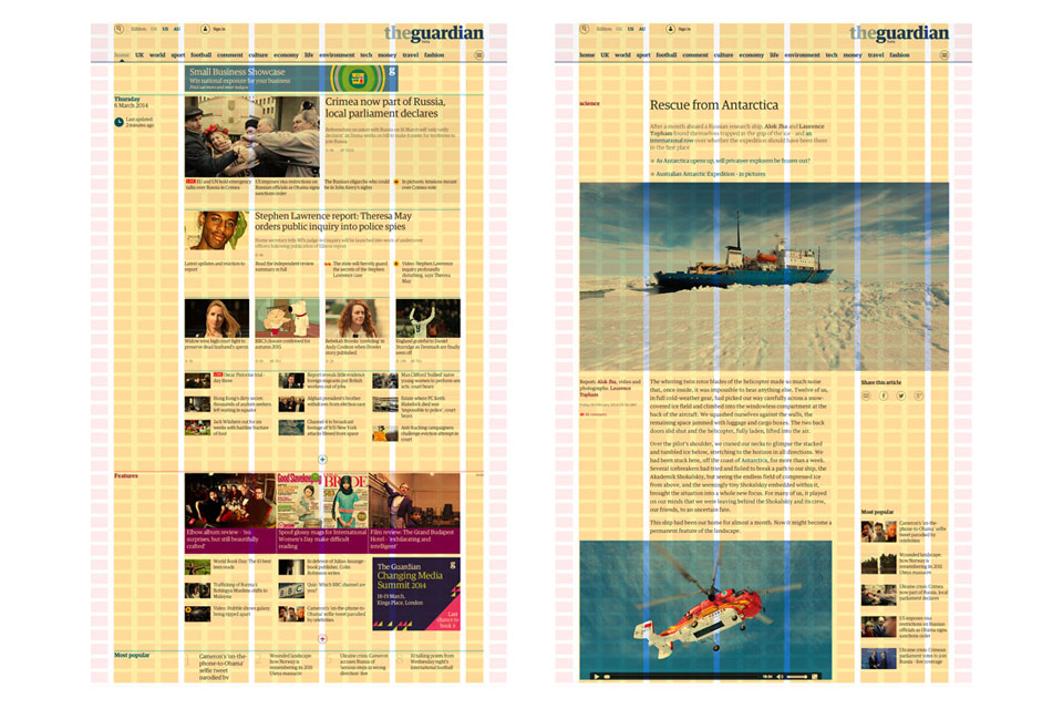
We introduced colour to signify tone - a visual cue to define the character of the content.
The use of tone to drive design will always grow and be in progress. Colour coding is a learned experience. Some are obvious familiar patterns, some not so, but that's ok.
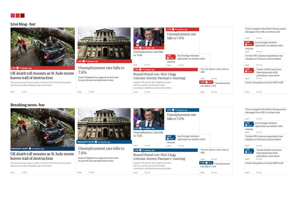
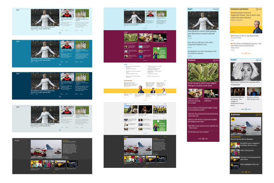
Banding - a new brand device

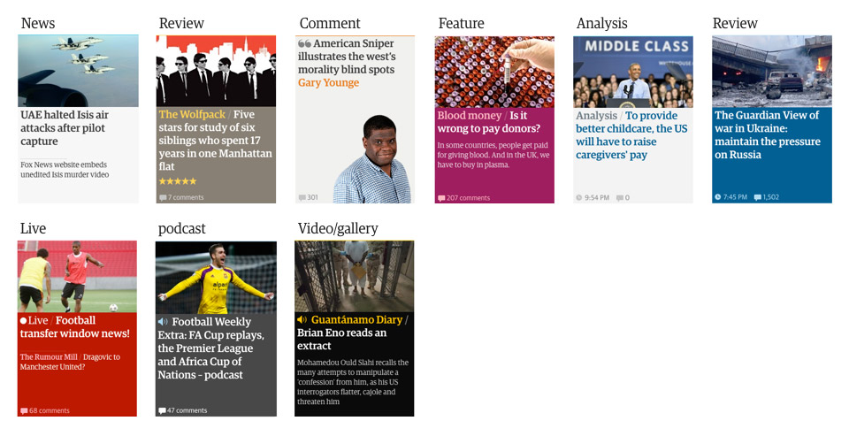
Editorial kickers
Kickers are a subtle way to draw the eye and break up headline monotony. They can also provide context of a story. Kickers can be served to a tag, a section, or custom written.
Sublinks logic
In the previous design, sublinks were used liberally to say the least - and often lost there purpose. We enforced a cultural shift for editorial to think about them. The 'blended containers' liberated the relationships of the story lists. Sublinks were stripped back a lot, reserved for stories of a certain importance.


